First starting idea draft-
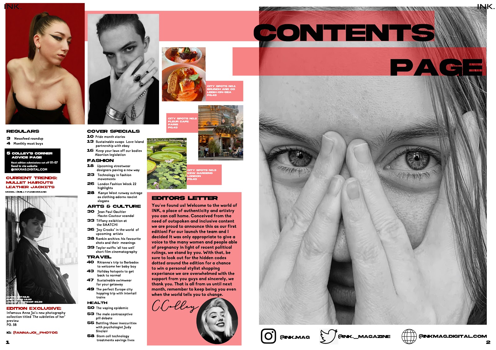
I decided I didn't like the layout and changed it for my 2nd draft by doing different fonts and overlapped lines of lower opacity to go against the black and white images, as I liked this layout I did the second draft for the beauty edition in it
DRAFT 2-
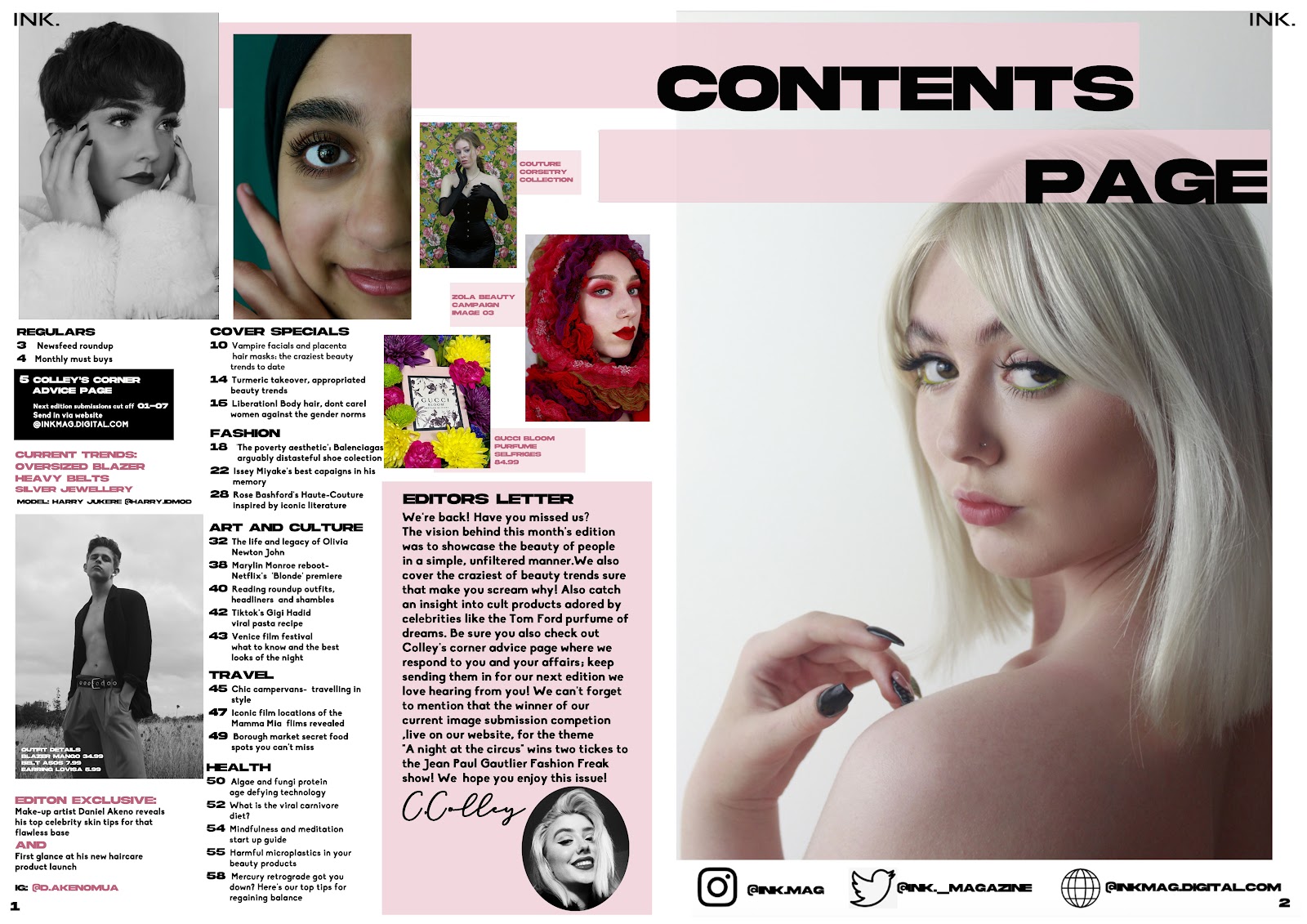
Reflection on draft 2 : there was no editors letter which was essential as well as the font being too difficult and bold to read when it was printed out. There also was issues with images and writing overlapping the middle line when folded. It also was brought up that the beauty edition didn't match the front cover in terms of colour.
DRAFT 3-
Reflection- layout is tighter and the pink colouring on the beauty edition contents is more cohesive with he front cover now. This is also the pictures after fixing my spacing, spelling mistakes and adding the editors letter with signature and photo. I also added the brand name to the top two corners of each edition for house style and brand identity.


