Sunday 23 October 2022

Final artefact: website tour including articles and 30 second video

website walkthrough silent

30 second video on website(with sound )

Here is a recorded tour of the website as
wix websites do not format across all computers the same way so the design may come up as unexpected. 

To avoid this I've attached an overview of what it should look like in the correct format. 


screenshot of main homepage as masthead got cut off


Tuesday 18 October 2022

blog update- website final article details

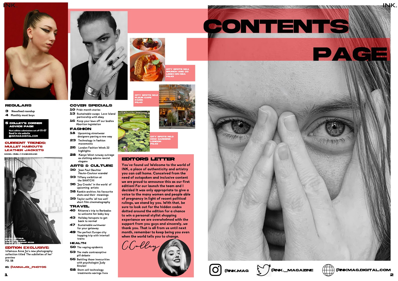
 As I changed my image from the beauty edition to be more impactful I decided to use it on my website to frame it in a way to comment on the horror held underneath of the glamorous presentation of the beauty industry we are typically presented with. Although the glamour is a typical convention (that can be seen in the image) it is important to consider ethical implications to what we see. 


I also added an online editors letter as I hadn't had one before and moved both that and the images of the covers to the homepage as this is one of the pages that will be marked. 


blog update: front cover changes


The main coverlines of these were changed to be more punchy alongside previously stating them as certain 'editions' not working with the brief. "Turmeric takeover" was used to comment on the cultural issue of appropriating beauty trends from POC without credit or understanding of the significance held in them. The other edition " handmaids horror" stemmed from the somehow political and cultural issue of women abortion rights paying intertextuality to the show handmaids horror and the signifiers it is associated with. 

There was also a slight change to the small detail layouts with edition and topic on the left side and date/price on the right. the barcode was also moved to the bottom to make it look less heavy on one side and more balanced. I also made note to leave a border around them as my spacing was usually an issue when printed. 

blog update- contents page evolution

 First starting idea  draft- 


I decided I didn't like the layout and changed it for my 2nd draft by doing different fonts and overlapped lines of lower opacity to go against the black and white images, as I liked this layout I did the second draft for the beauty edition in it 


                                                                       DRAFT 2- 


Reflection on draft 2 : there was no editors letter which was essential as well as the font being too difficult and bold to read when it was printed out. There also was issues with images and writing overlapping the middle line when folded. It also was brought up that the beauty edition didn't match the front cover in terms of colour. 

DRAFT 3-


Reflection- layout is tighter and the pink colouring on the beauty edition contents is more cohesive with he front cover now. This is also the pictures after fixing my spacing, spelling mistakes and adding the editors letter with signature and photo. I also added the brand name to the top two corners of each edition for house style and brand identity. 


statement of intent final