
.jpg)
If page contents is blurry this is a link to word document
30 second video on website(with sound )
Here is a recorded tour of the website as
wix websites do not format across all computers the same way so the design may come up as unexpected.
To avoid this I've attached an overview of what it should look like in the correct format.
screenshot of main homepage as masthead got cut off

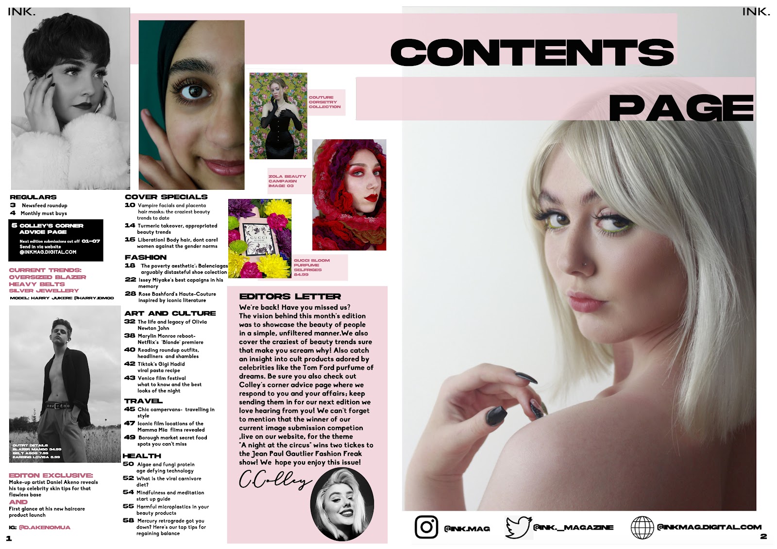
As I changed my image from the beauty edition to be more impactful I decided to use it on my website to frame it in a way to comment on the horror held underneath of the glamorous presentation of the beauty industry we are typically presented with. Although the glamour is a typical convention (that can be seen in the image) it is important to consider ethical implications to what we see.


First starting idea draft-

DRAFT 2-


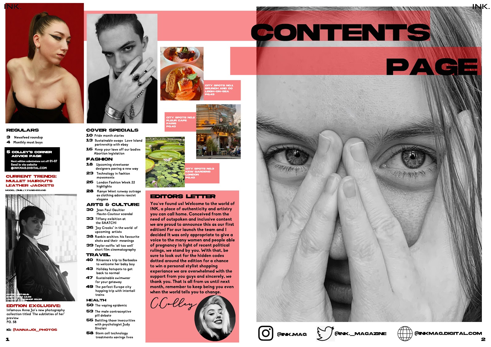
updated website and added the front covers to the homepage following a discussion where I realised only two pages are actually marked so I converged them
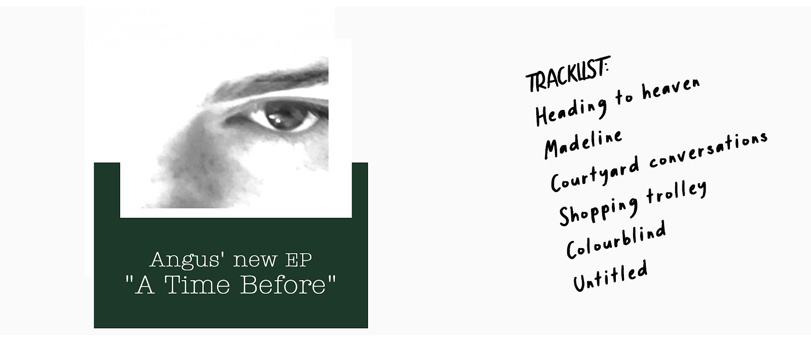
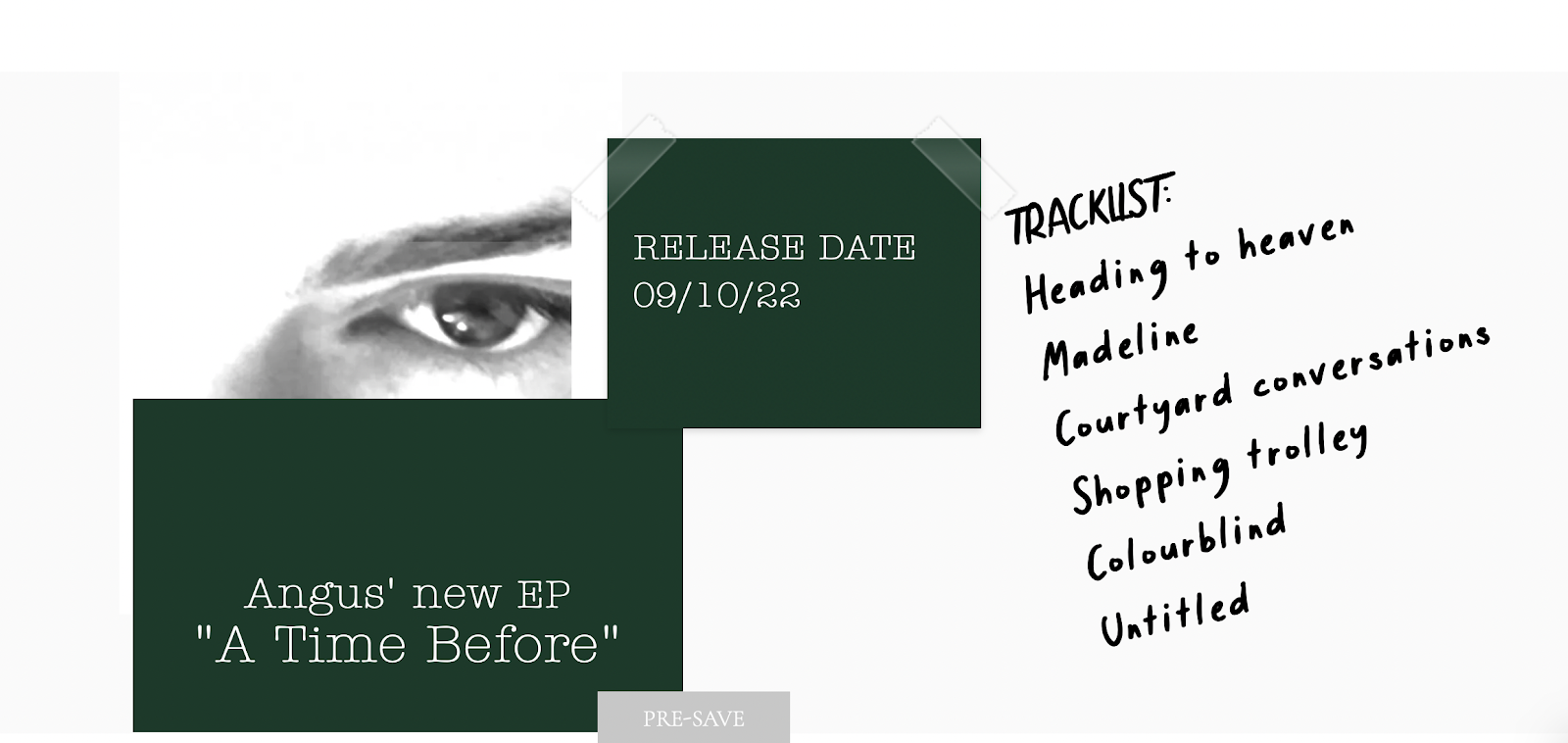
added a music 'ep' (that is a hover icon that pops up the date) to the homepage as I realised I was missing anything music related
I may add black and white trees to the background to tie in with the folklore theme


