Wednesday, 30 March 2022

planning: models, locations, shot types

main model 1- 

name: Grace Fane 

location 1: set up photography studio 

location 2: around  London 

magazine edition: beauty and fashion 

colour palette and details- red backdrop, black makeup, slick hair 

                        red backdrop, red makeup, red blazer, slick hair

shot types- medium close up, close up for details, medium shots on the shots with blazers 


main model 2- 

Lillie Elston

location: set up photography studio 

magazine edition: beauty and fashion 

colour pallet and details: 1- white backdrop , natural skin, white eyeliner, lashes, volumes hair 

                                       2- floral backdrop with colour details of green, pink, blue, volumes ponytail.

shot types- medium shot, high angle downward shots, close up facial shots.


main model 3- 

Gaby Jarret 

location: set up photography studio 

magazine edition: fashion 

colour pallet- pink backdrop, white and pink outfit, pink detailed lipstick, natural hair 


main model 4- 

mia petchy

location: set up photography studio and London streets

magazine edition: beauty and fashion 

colour pallet- emerald green and red 

shot types- downward angle, mid close ups 


other model names- 

ayra khan - beauty

gurgeena - beauty

Annabelle jarret - beauty 

Madeline Schneider - beauty 

self portraits of myself 


Planning: front cover and internal pages flat plan


Planning: website flatplans


-some brief mockup flat plans of the website layout and topics 


planning: non exam examiners report

https://ocr.org.uk/Images/504487-delivery-guide-nea.pdf

what I learnt: 

- include a key sense of branding across the two covers ie.) a clear house style through the typography layout masthead etc

- the webpage is a form of digital convergence, it too should have the rand identity but also allows for a broader array of topics 

-ensure that the products meet the brief in terms of : written text, images, miss-en-scene, graphics etc and on the websites through the content, menus, navigation bar topics ect. 

planning: pitch

 Magazine edition 1- beauty 

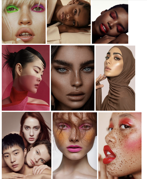
within this issue I aim to Create an inclusive landscape demonstrating a variety of ethnicities and religions.

 I aim to keep the front cover as simplistic as possible whilst still including aspects to engage an active audience such as appropriate coverline that relates to the internal content. 


ideas and aspects topics I can include

- bold front cover with a direct mode of address to engage the audience but also highlight the makeup as it is a beauty edition 

- a possible article detailing the still prevent issues surrounding beauty and the unrealistic, unattainable standards perpetrated by various media platforms and how this effects the likes of the 'everyday' person

-alternativly an article could be done on a more scientific level such as some articles that dazed has which details the scientific benefits of certain skincare and new evolving developments in that industry such as the controversial rise of snail mucus 

-this could lead to an article on the craziest skincare trends and facials that celebrities have done such as the vampire facial where celebrities reinfect their blood back into their face in the hops of producing collagen.

-include a range of product shots such as skincare items and perfumes to adhere to the consumerist aspects of lifestyle magazines but also appeal to the 16-24 aspirational market who will have interest in these parts. review on expensive perfume 

- exuberant images with colourful makeup that stands on its own within the content, this Will be achieved through coloured backdrops, bold but not overdone makeup and confident posing. 


magazine 2- fashion 

within this I aim to showcase individual style in a tailored high fashion way with reference to fashion house campaigns such as YSL and their use of black and white images with brand name in the middle.

strong direct mode of address across the images 

 I aim to include challenging codes of dress such as a man in colourful trousers and blouse, inspired by the fluidity in harry styles. 

I also want to include coverlid reference to internal article surrounding  around how people use fashion to express themselves 


- two different mise-en-scenes will be fulfilled through alternate backdrops and some in outside locations 

- different representation will be fulfilled across the print and website through a range of ethnicity and religion.

-masthead: INK.  sell line: make your mark.   website: subscribe for all the future INK. spills 


topics and aspects  that could be included-

- stranger things new season (Madey image) lends intertextuality 

articles for both coverline and print 

-we will not be silent - Ukraines response- video of drummer at sight of sandbag gathering 

- the drama at the oscars - will smith 

'could your online lover be a scammer' 'bounteous bachelor or frivolous fraudster?'  Netflix documentary tinder swindler Simon levive 

- oscars" break the glass ceiling" west side story across first queer woman of colour to win an Oscar 

- Brighton season two- worth the hype?- reference to the secret event in London (exclusive)

- 'authentic, courageous and enough ' interview of queer coming of age story

- from charity shop to chic'

- interview with lead singer of band- how music influences my style

- inauthenticity surrounding recycled trends 

- coachella 2022- get the style of the stars - hits and misses


'colleys corner' sent in questions and advice column 


- an article on growing unsustainablity 

-an article like  "from charity shops to designer' with completely second hand outfits made into high fashion appearing outfits "from charity shop to chic"

- an article on upcoming must see designers such as central Saint Martin graduate Miss Sohee who recently released a collection 

- an article on the binaries of fashion and the sometimes negative aspects of the art form 

-variety of shots such as close up jewellery shots, shoe shots as well as full body outfit shots 

- a humorous article on the absurdity of the 'body shapes such as hourglass, apple'  etc

-pinnacle moments in the industry- Jennifer Lopez Versace dress etc. 

- a series of interviews on the importance of having fashion as an expressive landscape 

"my style my identity..."

- photos paying intertextuality to shoots like David bowie 

- interviews of peoples experiences 

tell the stories of those who use fashion as an expressive landscape


Tuesday, 29 March 2022

planning: representation within the magazine

 I personally think that diverse representation across media forms are absolutely essential and fundamental within contemporary society. within the historical context there has been various cases os misrepresentation or underepresenation of the majority of minority groups based on factors such as ethnicity, gender, sexuality and so forth. the majority of the time these groups do not have control over their own narrative and are subjected to the hands of media in both magazine, news and social media. I aim to create a product free from constraints and exclusion, I wish to include a range of ethnicities, religions, sexualities and overall appearance, inclusion is vital.


1.)for my First edition I wish to do coverage on beauty, however I aim to include a range of ethnicities once again and religions such as those who follow the religion of islam. I also wish to contradict the norm of defined beauty and include images of those with acne also partaking. the overall goal is to create a diverse and inclusive landscape within the editions and have that as the basis of the brand, covering the essential topics that lifestyle magazines do but in a comforting and inclusive manner. 
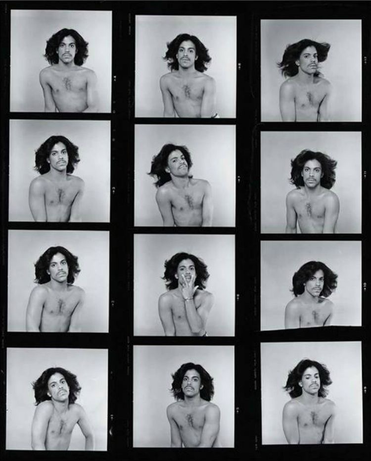
3.) for my second edition I wish to do a fashion edition- within this I ensure to create a diverse landscape through offering the elements of high fashion and high quality thought through images of gender fluid outfits as seen in his profile models and artists such as harry styles as well as articles on charity shop outfits removing the stigmas

idea three: fashion moodboard


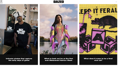
website analysis 2: dazed magazine


layout- more geometric in the composition- stories are played out as interlinked with some being elongated portrait and others squares aligned next to each other 

a separate entirely drop down menu- makes the top of the webpage appear less cluttered as opposed to having all the topics at the top- they are instead tucked away and hidden

the brand name is still at the top of the page- this indicates too a strong sense of brand identity and the font type being the same as is similar to paper creates a strong house style.

separate easy access categories placed down the side as seen in the "news" section with stories.

subscribe option seen as soon as you open the website which encourages an active audience and also engagement surrounding the brand which obviously gives it commercial success and allows for higher rates on adverts and such

language and images- stories in the news section on the main 'page' such as Ukraine coverage as well as new upcoming fashion house collaborations. the breadth of the coverage indicates the wide range and diversity of interests audiences have and that all topics are not limited to fashion etc that may be connoted in the front covers instead audiences engage with topics such as politics etc on magazine publications as well as news.

sense of closeness represented " wants his photos to make you feel seen" although its a reference t a successful person its shared in a way that is impactful and the focus is on the meaning being work and human connection rather than just celebrity culture that we have no relation to. it reflects the brand as connective. 

hyperlinks to social media accounts demonstrated by just the logo- depicts the idea that audiences will have the cultural competency to understand the logos and also the technical capabilities to utilise these platforms. 

the topics covered are much broader they have reference to science, politics art and so forth indicated in the drop down menu but the fact they do indicated a well educated, informed and interested audience. 

highly diverse array of images- some appear to be editorial created and well planned whilst others appear more candid, they also adopt a wide range of both ethnicity and gender across the website. 

t


website analysis 1: paper magazine


layout- paper magazine adopts a simplistic layout with segregated stories in boxes. 

there is a navigation bar at the top of the website with the categories the magazine covers.

brand name at the top of the website- crates brand identity 

each store has a black strip with the topic on to make them identifiable to the audience and reflects the quick natured culture surrounding the demographic of needing instantaneous bite sized chunks. 

on each separate category it is defined by a black border of the topic- it makes it identifiable and the nature of black and white looks very simplistic but sleek. 


navigation bar- located at the top part of the website even as you scroll down it stays there- this allows for exploration of the website easily and effectively- it saved the time and hassle of having to scroll back to the top to explore other articles, highly reflective of the nature of the demographic. 

the navigation bar includes the broad general topics but also has drop down menus including things like under care"lqbtq, Black Lives Matter" and so forth. 

interestingly the navigation bar also includes a section called 'break the internet' which with the demographic being highly social media saturated makes perfect sense to cover viral internet sensations that they can relate and engage with. 


language including images- the logo in the same typeface as the on the magazines to solid the house style and brand identity 

direct reference to site celebrities- crates a sense of aspiration but also interest in that culture and phenomenas- due to the magazine reflecting the social and cultural zeitgeist there is a high focus on the oscars which occurred in recent times, hence the cutout effect of the celebrity photos of their Oscar outfits. 

it indicates that the audience is interested in fashion and the culture in which it arises out of pinnacle high society events. 

many main and sidebar articles include rhetoric questions- purpose being the make the readers question what they  though was right about the situation and encourages them to read the brands publications to find out the truth 

reference to social media star' Francis' indicates the audience will have the cultural competency to know who this is and relate to who is is based on upcoming contemporary social; media "TikTok"

references to finical moments in society surrounding current affair topics for example actress from west side story being the first queer woman of colour to win an Oscar. 

the website has adverts on the side which is possibly reflective of the decline in print and the shift ti digital media but adverting still being a source of revenue for the brand. 


idea two current affairs- authentic queer representations

 -tell the story of queer culture in a sensitive, real and credible way with references to how people express and come to be the people they are 

-highlight the struggles that people face everyday through compiled interviews and coming of age stories.

-represent a community that typically has toxic, unrealistic representations in the the media about queer experience

-aim to demonstrate the faces behind the stories you hear and the normality they posses. 


Example photography ideas for the magazine:


audience survey research and conclusions


the most popular categories are fashion and music which are typical of the targeted demographic the votes are more swayed towards fashion however there is slight interest in current affairs. this helps to inform my decision as the majority focus will be on fashion with potential underpinnings of music and social contexts. 

possible ideas from this; EDITED CHOICES

 queer influence in music industry fashion (Freddie mercury, David bowie)

a comment/recap of the most iconic fashion trends in the music industry 

edition: music in fashion trends article: how to: 'the style of the glam- rockstars' 

current affairs- queer representation, strength and stories that are real and relatable (strength, recent representation, stories and realism)   chosen idea 


social media is a key area of there people choose to consume magazines with online website close behind- indicates that there has been a significant shift to online platforms. 
online websites should reference media and include hyperlinks to social media accounts. 

vogue is the major front runner in mostly consumed magazines- this is typical of the large conglomerate it is and its appeal but also the type of cover-lines and content may be ie a focus on beauty fashion and aspirational content based own consumerism. some vogue editors do also contain inspirational stories of peoples roads to success as well as the last chapter on upcoming designers, artists etc. there is also reference to art and high culture within their magazines. 

media careers dominating- articles to include media industry references etc. 

interests of the survey that can be incorporated into the themes 


Friday, 25 March 2022

planning: summarisation of key conventions

 Dependent of the style of magazine they usually either take on the minimalist approach typical of the more editorial approach, adopting a lack of coverlines and sleek bold images in its place. More conventional magazines such as cosmopolitan and harpers bazaar make use of busier covers with lots of coverlines and less focus on the stylistic elements within the image. i personal want to try and aim for a more simplistic cover with emphasis on the image and the editorial aspects held within lifestyle magazine covers. I aim to create a beauty cover as one of the editions with a reduced number of coverlines in order to have more focus on the impact of the image and the details of the image just like the vogue edition with the intense detail of the image. I also like the more simplistic layout of front covers such as paper magazine with a bold masthead ad border surrounding the image, I think the border makes the front cover look sophisticated and sleek. 


I aim to adopt the essential codes and conventions in able to be identified as a lifestyle magazine such as barcodes, reduced number of coverlines, direct mode of address on the front cover and a large bold masthead. I aim to create a sense of brand identity across covers such as similar typography in the masthead ad the same layout to create a house style.  I want to incorporate the colours of the images into the typography such as red accents. puffs are also a common conventions of magazines however unless it essentially goes with the layout of my front cover as it may look a bit cluttered however if used the puff will include reference to winning a competition or inside editions. I also wish to incorporate a date line and edition specification as it is a common convention of aspirational market magazines. 


Thursday, 17 March 2022

textual analysis: Harpers Bazaar


typography-
sans-serif masthead, more typical type of font for magazine brands. 
slightly alternative masthead- harpers in small font above with bazaar the main masthead- however it does support conventions of magazine brands using one word as a title. 

use of larger fonts to emphasise certain cover-lines as the main for example"fall fashion issue" placing an emphasis on consumerism and aesthetic based topics typical of lifestyle magazine 

layout- 
typical layout with masthead at the top and a main image- 
cover-lines adorn the outsides of the image as not to obstruct 
edited on aspects such a 'exclusive' and 'ultimate shopping guide'- aids the ephemeral nature and how you have to buy it as its exclusive- shopping guide furthers the idea of consumerism- red edited on features stand out as importance against the pink. 


language and image- 
reference to high fashion- Chanels iconic tweed runway and those with the cultural competency will recognise this 

mid long shot- we see both outfit and gaga's codes of gesure holding a dog- rather stereotypical representation of pink colour pallett, holding a dog. 
contrasts the other analysis's with a lack of serious journalism and a focus solely on beauty and fashion. 

codes of gesture- passive but those with cultural competency will be shocked as gaga has an iconic dominant stance.

can clearly see cleavage- empowerment or sexualisation. 

exaggerated wig and hat create an editorial aspect typical of gagas nature outside of the photo shoot and cover. 

idea of aspiration constructed through the fact she is dressed in Chanel holding a Chanel bag etc, creates a sense of aspirational elitism 

reference to Audrey Hepburns grandchild- reference to celebrity life and references the legacy of socialite fashion, film etc stars. 
 

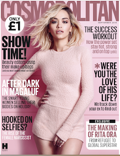
textual analysis: cosmopolitan


typography- 
continuous sans-serif 
various cover lines in capitalised sans-serif font to stand out and add boldness to the cover- it makes it stand out against competitor magazines 

iconography- 
Hearst brand logo bottom left corner- brand identity across brands
puff bottom right- typical convention of magazine- makes the make controversial story stand out. 
price puff- clearly states price and the status of the brand "the no.1 womens magazine'

language and image- 
codes of gesture- cheeky and playful- plays into the context of rising above standards- mocks industry for body image standards. 
challenge to conventional models and to traditional body standards- clear view of cellulite and authentic women's bodies not hidden but glamourised. 

connotations of tattoos typically frowned upon by an older demographic, however connotations with younger target demographics is an expression of individuality presents a confident and empowered woman. 
typical conventions- date line 


'wants her haters to kiss her ass' - strong imagery, ass- weak expletive and colloquial term- adheres to audience demographic reinforced by calling her a "supermodel" informing the idea that cosmopolitan stays with the diverse nature of models and contrasts the stereotypical notion.


references to sensitive hard journalism surrounding rape- different from the usual fashion and beauty focused editions. 

reference to hashtag me too adheres to audiences who will be aware of these campaigns but also offers cross media convergence as you can search the hashtag on social media platforms. 


Tuesday, 15 March 2022

planning: idea one: beauty


Textual analysis: Vogue


typography- 
-sans serif typical of mainstream magazines, adheres to the brand identity of vogue with the iconic typography 
-bold 'the fashion issue' to easily establish the purpose of the brand eye-catching to stand out on the shelf 
-referencing to stars- indicates audience will have the cultural competency to know who these people are. 


layout- 
prototypical features with a bold masthead centre top of the page 
subverts with a lack of coverlids but is typical of the editorial style of this cover 

use of language and images-
main image with a direct mode of address to engage with the consumer, it creates a 'bond' 
thin eyebrows connote to the liberation of the 20s and female empowerment 
juxtaposed by fragility and femininity of flowers but suggesting femininity as a sign of strength
bold dark lip- typical of the rich colours- aids the powerful imagery 
high key lighting- typical of the conglomerate of vogue, professionalism
hand placement- adds emphasis to the face and furthers the sense of delicacy 
close up shot- allows for details of the face and flowers but subverts typical presentations of sexualisation. 


Industrial context- Hearst media as a brand


Hearst communications is a multi- media conglomerate and mass media business who own nothing short of  newspapers, magazines, television channels and stations just to state the media platforms. in the formative years of the company readership grew from 15,000 to well over 20 million both reflecting the popularity of the magazine industry and also the commercial success of the company. The company hit peak In the 1920/30s as the company hit high levels f commercial success later merging the brands Hearst international with Cosmopolitan In 1925. They have a personal aspiration to offer "innovative, positive and ambition in stride".

Magazines that Hearst owns:

-cosmopolitan 

-good housekeeping 

-ELLE

-Harpers Bazaar

-Esquire 

to name only a few. 


Cosmopolitan media packet analysis:


MAGAZINE FRONT COVERS ACROSS VARIOUS MAGAZINES:


similar conventions-

-Bold masthead at the top of the page 

-Both Harpers Bazaar and Elle make use of serif fonts across all aspects of typography 

-Cosmopolitan uses serif fronts across all areas of typography 

-Theme of consumerism across all magazines: 

                                                   HB 'what to buy now'

                                                  Elle 'the best skin cream on earth' 


-Main images have direct mode of address to address and engage with the audiences 

-All magazines contain cover-lines lauding to celebrity drama/ confessions 

-There is a focus on fashion, beauty and fitness trends prevent across the majority of the coverlines. 

-Coverlines are placed against the edges of the magazine central around the model 

industrial context: contemporary


20TH CENTURY 

Magazines have become a source of primary advertising functions due to the consumerist nature of contemporary society. The overall stream of magazines had broadened into both mainstream and niche entities in able to reach various demographics and psychometrics groups of specialised interests. However within the industry there are a few dominant conglomerates that own many of the population and successful publications in the media landscape. Examples of these include Conde Nast and Hearst. In contemporary society there is also prevalent focus placed on sensationalism within the articles. there are also notable independent brands such as The Big Issue. 


many individuals also now consume their content on online platforms such as websites/subscriptions. this reflects the advancements in technology as social media developing from 1997 and the creation of the internet in 1983. It can be argued that print is in decline however there's still market for them as many choose to purchase print for experience/gratification purposes. 


HOW MAGAZINE COMPANIES FINANCE AND DISTRIBUTE MAGAZINES:

FINANCE- 
-through online and print subscriptions where consumers will pay for a set amount of copies
-advertising across both print and digital(usually for 7 days )
-sponsorships/sponsored content
-live streaming to engage an active audience 
-video content online 
-holding events 


DISTRIBUTION-
-print publications in shops etc
-social media 
- online websites
-blogs


media conglomerate media packet analysis 


industrial context: history of magazines

 INITIAL ORIGINS OF MAGAZINES: 

Magazines could initially be sourced from forms such as pamphlets, broadsides, Ballads, chapbooks. equipment such as the Gutenburg press made printing a possibility leading to magazines being the bridge between a book and newspaper. The earliest form of this publication can be argued to be what is known as the ' Erbauliche Monaths-Unterredungen' initiated by Johann Rist a poet. the art of short writing then became popular in regions such as France, England, Italy and various other western countries.


modern day example with clear conventions of cover-lines, photography and such 


17th century origin magazine comparison, lack of colour, illustrations in the form of newspaper layout. 


LATE 18TH- 19TH CENTURY:

Magazines were typically, when they initially started developing, were aimed at those who could afford them. However we see a shift to magazines companies adopting a wide market audience strategy. within the late 28th to 19th century there is an evident shift from magazines covering topics like improvement, enlightenment, family entertainment, housewife tips and so forth. at the end of the century however there is a focus on publications providing entertainment due to audiences need- this then developed the market into what we now have as categories 


THE EVIDENT SHIFT IN WOMENS LIFESTYLE MAGAZINE;


Women magazines heavily reflected the changing roles of women within society such as initial domestic

publications such as Godens lady book and various other domestic and housewife centered publications to more consumerist, fashion, beauty and lifestyle magazines. Although it does effectively demonstrate the change in typical housewife role and stereotypes, it does present the idea that women targeted magazines and their audience do enjoy aestetic based topics. this is highlighted by the top five lifestyle magazines in 2020. 


DEVELOPMENT OF ADVERTISING IN MAGAZINES:


Magazines became a viable source for advertising due to technological advancements for example: the introduction of the rotary press in the late 19th century, this therefor made them more readily available and thus in higher circulation due to the cheaper and more effective nature created by technology. this too made them more accessible to all types of demographics rather than previously targeted middle and upper classes. the use of eye catching images evolved as technology did, with the introduction of high quality digital SLR camera shots and colourised images. this led to the advertising industry becoming invaluable economically with magazines being a primary source of circulation for them. 


statement of intent final