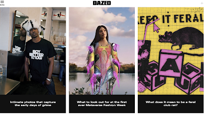
layout- more geometric in the composition- stories are played out as interlinked with some being elongated portrait and others squares aligned next to each other
a separate entirely drop down menu- makes the top of the webpage appear less cluttered as opposed to having all the topics at the top- they are instead tucked away and hidden
the brand name is still at the top of the page- this indicates too a strong sense of brand identity and the font type being the same as is similar to paper creates a strong house style.
separate easy access categories placed down the side as seen in the "news" section with stories.
subscribe option seen as soon as you open the website which encourages an active audience and also engagement surrounding the brand which obviously gives it commercial success and allows for higher rates on adverts and such
language and images- stories in the news section on the main 'page' such as Ukraine coverage as well as new upcoming fashion house collaborations. the breadth of the coverage indicates the wide range and diversity of interests audiences have and that all topics are not limited to fashion etc that may be connoted in the front covers instead audiences engage with topics such as politics etc on magazine publications as well as news.
sense of closeness represented " wants his photos to make you feel seen" although its a reference t a successful person its shared in a way that is impactful and the focus is on the meaning being work and human connection rather than just celebrity culture that we have no relation to. it reflects the brand as connective.
hyperlinks to social media accounts demonstrated by just the logo- depicts the idea that audiences will have the cultural competency to understand the logos and also the technical capabilities to utilise these platforms.
the topics covered are much broader they have reference to science, politics art and so forth indicated in the drop down menu but the fact they do indicated a well educated, informed and interested audience.
highly diverse array of images- some appear to be editorial created and well planned whilst others appear more candid, they also adopt a wide range of both ethnicity and gender across the website.
t


No comments:
Post a Comment